Introduction To the Design of Mid-Century Modernism
Mid-Century Modern is a term often used to describe the aesthetic of new products, particularly furniture. But using it that way is a misnomer. The term refers to a “golden age” of architecture and design; a generous timeline places Mid-Century Modernism from 1933 to 1965 or even beyond, but purists say it only lasted the ten-year period post World War II from 1947-1957. It can be summarized by the phrase “form follows function,” generally lacking ornamentation and solving design problems in minimal and clean, simple modes.
Mid-Century Modernism is a style that isn’t easily defined. One of the many reasons for this is because the works conceptually overlap other styles of the time. It is often viewed as the American response to European, South American, and other global types of modernism like the International Style or Bauhaus movements. Its post-war timeline was an important factor in the design typology of Mid-Century Modernism as designers were racing to house and modernize American suburbs.
The names and design examples on this list of graphic design works, furniture, industrial design pieces, and architecture are by no means exhaustive. Many familiar with Mid-Century Modernism may even believe that some of the below works do not fit the “criteria” of the style and may instead fit better as International or Bauhaus style works of architecture or design.
Read on see how Mid-Century Modern made its way into the fabric of all types of design.
Mid-Century Modern Graphic Design
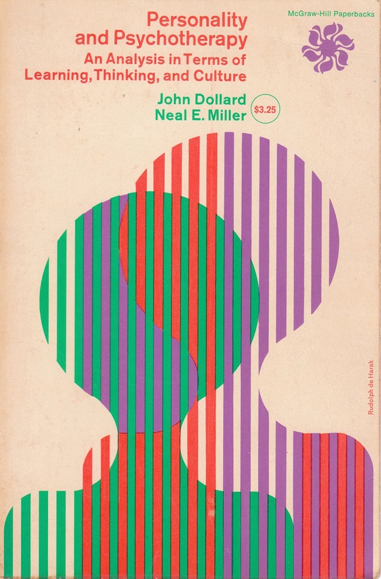
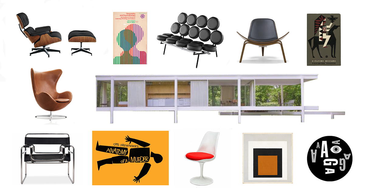
Rudolph de Harak, “Personality and Psychotherapy Paperback” for McGraw Hill (Photo: AIGA)
Graphic design may be the most difficult form of Mid-Century Modernism to define. How do the qualities and ideals of buildings and structure translate to a work of art?
The Bauhaus had the largest influence on graphic design. Lessons in minimalism and typography carried over when the New Bauhaus School of Design was established in the early 1940s. Design everywhere was also abandoning decoration or any unnecessary lines or patterns. The resulting work is typically abstracted or simplified forms that no longer tried to achieve realism. The design process was an iteratively subtractive method where work became “purer” and simpler as it improved, instead of more detailed or busier.
Flat graphics and Minimal Color
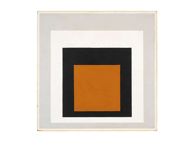
Josef Albers, Painting (Photo: Josef & Anni Albers Foundation)
If you tried to imagine what minimal graphic design would look like, this is probably the most obvious characteristic. Images are “flattened” into 2D compositions. A small range of colors are used to demonstrate only the most critical variation in shadow or changes in material. Every new shape or color is only added if it serves an important purpose, sometimes to contrast another or sometimes to add a new relevant layer of information.
Simplified or Abstracted Shapes
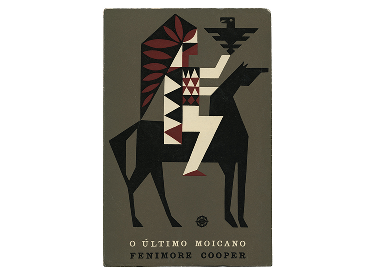
Joao da Camara Leme, “The Last of the Mohicans” Posters (Photo: Envato)
Instead of intricate posters or logos, many Mid-Century Modern graphic works broke down images into shapes or abstractions of the original image. For example, Joao de Camara Leme’s poster for The Last of the Mohicans featured a man in a horse who is simplified into dynamic triangles and rectangles. While slight curves are still used, large areas of detail are simplified into recognizable geometries. For example, the horse’s body is simplified into a rectangle, the eagle is a pyramid with slices cut out to signify wings, and the feathers on the man’s hat are ovals rotated along the black shape of the headpiece. Though much detail is lost, the image remains clearly understood in an elegant composition.
Clear and Prominent Typography

Paul Rand, Assorted Logos (Photo: paulrand.design)
With a style so influenced by the Bauhaus, typography is sure to be an important component. Many designers were also influenced by the Swiss International Typographic Style which resulted in simple sans serif text with neat organization. Much of these influences can be seen in certain lowercase sans serif logos for companies that still exist today like ABC.
Those designers whose style were closer to Bauhaus ideals tended to have more unique typefaces that played with shapes and unique serif styles. In this style, the text could begin to take some of the characteristics of the works they were describing and even paint mini pictures within titles. This is a further example of the subtractive process that tried to fit information into a minimal design move.
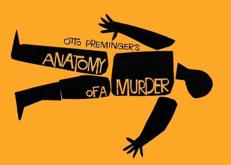
Saul Bass, Anatomy of a Murder Poster (Photo: The Saul Bass Archive)
Furniture
Industrial design products, including furniture, had a similar design logic to the architecture of the time. Designers tried to create pieces best suited to a new adapting post-war world. It may be best summarized by Cara Greenberg in Mid-Century Modern: Furniture of the 1950s which explains, “multipurpose became a catchphrase… This new furniture stacked, folded and bent; it was rearrangeable and interchangeable; it nested and flexed. Chairs were designed to be pressed into service for a dozen different reasons. Tables were nonspecific, for eating, writing, or playing cards.”
Though difficult to separate from the qualities of Mid-Century Modern architecture, furniture and other products of the time were designed with a similar minimalistic ideology. For many, design was not necessarily about creating a piece of art, it was about solving a problem in the best way and doing so elegantly and honestly. Here are some general characteristics of the furniture of this time.
Lack of Ornamentation, Minimal Pieces
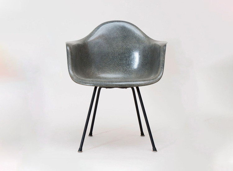
Eames, Eames Shell Chair (Photo: Artsy)
As is always a part of minimalism, these pieces all lack unnecessary decoration. In fact, many pieces even begin to eliminate or minimize existing layers or pieces of a traditional piece of furniture. For example, many chairs are simplified from a seat and a back into one continuous surface that serves as both (think the Eames shell chair). Still, others minimize structural elements so that the piece appears to float, creating a hierarchy between different pieces of the product.
“Pure” or Honest Materials
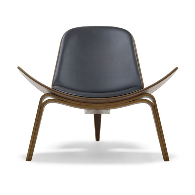
Hans Wegner, CH07 Shell Chair (Photo: Danish Design Store)
With simplicity in execution also came a simplicity in materials. Wood became a popular choice in part from the Scandinavian furniture influence popular in Mid-Century Modernism. It was also popular because it was a natural material. Finishes were also natural and helped tie together spaces that were designed to reflect and connect to nature.
Bold Form or Shapes
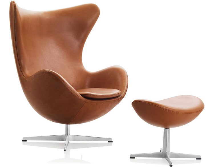
Arne Jacobson, Egg Chair and Ottoman (Photo: Hive Modern)
As demonstrated by the Eames’ iconic Shell Chair of Arne Jacobson’s Egg Chair, bold or unusual shapes were common for Mid-Century Modern furniture. This may be the case because designers were attempting to rethink each piece and redefine the necessary pieces that make up a chair, a table, or any other design problem. This resulted in a shape that does not quite look like a “normal” chair or table.
Focus on Function
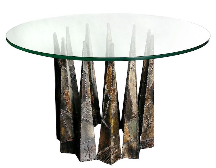
Pual Evans, Evans Table (Photo: 1st Dibs)
Though form was important, designers would not sacrifice the quality or function of the piece for a gimmicky form or shape. These pieces were designed to be flexible and adaptable. They often fit into each other or folded for easy storage. These were examples of the popular design adage, “form follows function.”
More Examples of Mid-Century Modern Furniture
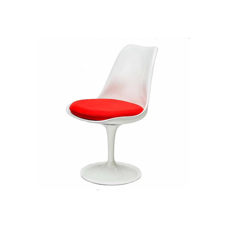
Eero Saarinen, Tulip Chair (Photo: steelform)
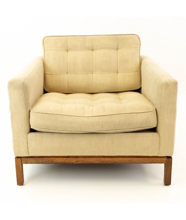
Florence Knoll, Knoll Club Lounge Chair (Photo: Modern Hill Furniture)
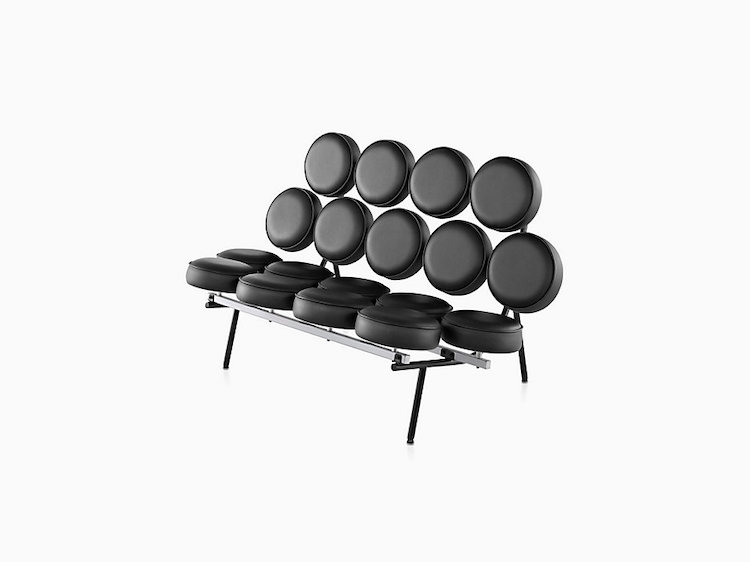
Irving Harper, Marshmallow Sofa (Photo: Herman Miller)
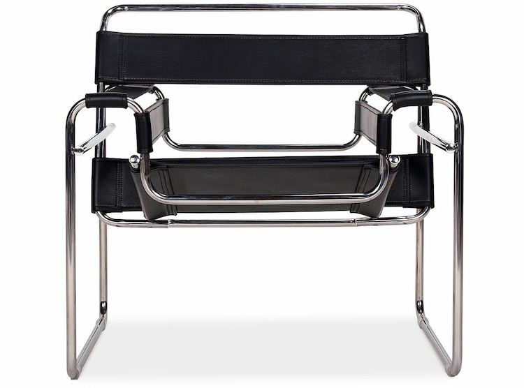
Marcel Breuer, Wassily Chair (Photo: Eternity Modern)
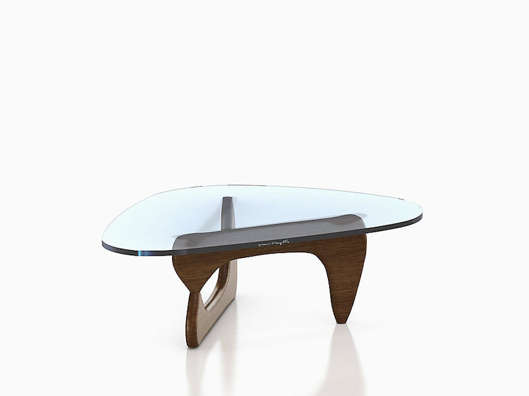
Noguchi Table (Photo: Herman Miller)
Architecture
Mid-Century Modern architecture is probably the easiest category of the design movement to define. Architects were inspired to reimagine the way we live after the horrors of WWII. Ideas were quickly spreading and being shared; designers were trying to define the perfect way to solve problems, create a new and exciting way to appreciate space, and to give everyone access to good design.
The resulting formula made for living spaces that are still popular today and many of the ideals like transparency, openness, and a connection to nature are still considered pillars of good residential architecture. However, Mid-Century Modernism was not just for the post-war American suburb. It had an effect on public buildings, infrastructure, and so much more. It still inspires architects today as we define our brand of “modern” buildings. You may recognize some of the following qualities as things you still see today.
Transparency and Openness
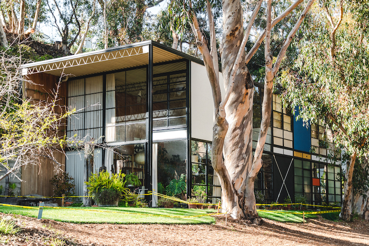
The Eames Foundation, previously the residence of Charles and Ray Eames (Photo: Stock Photos from Stephanie Braconnier/Shutterstock)
Large horizontal windows are a pillar of Mid-Century Modern design. They were often used in the main living space and further reinforced the other important characteristic of the style: a connection to nature and the outdoors. Since these designs often had little ornamentation, light played a key role in how the space was experienced. The contrast between solid and void or heavy and light demonstrated in the opaque versus the transparent pieces of the façade has also become an iconic characteristic of the style.
Flat Roof
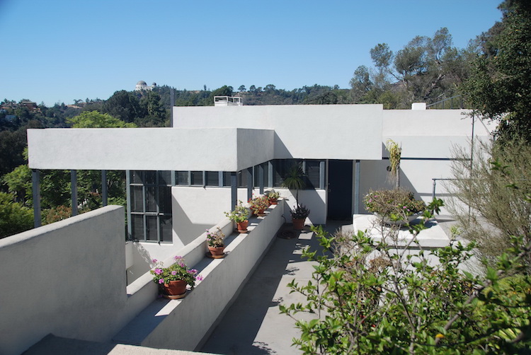
Richard Neutra, Lovell House (Photo: Michael J. Locke/WikipediaCommons)
Flat roofs are one example of how important clean lines were in this design style. Since spaces were considered individual and often boxy volumes, the roof was typically a flat plane that simply closed off an interior volume. Though not all projects used flat roofs, they were very common and tended to reinforce the horizontality present through the large windows and the vertically shifted horizontal boxes that composed some Mid-Century Modern buildings.
Natural Colors and Textures
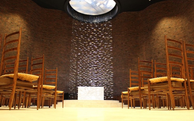
Eero Saarinen, MIT Chapel (Photo: MIT)
As is obvious from much of the furniture of the time, this design style used natural or pure materials. This is partially an extension of minimalism and partially inspired by Scandinavian furniture that helped define these interiors. Bringing nature indoors was also an important idea in this style since designers hoped to encourage the users of the spaces to spend more time in nature.
Shifting Levels

Though not accessible to everyone with mobility issues, homes were designed as a series of shifting volumes sometimes separated vertically. Small elevation changes were accommodated by a few steps between rooms or between entire portions of the home. These did not constitute entirely new levels but added complexity and layering to the separation of different rooms.
Integration into Nature
This point is often closely connected to the idea of transparency. Rooms were integrated into nature by preserving views of the outside world and orienting the room towards this direction. Living spaces were often designed to encourage users to go outside and to appreciate the natural world in order to lead a healthier life.
More Examples of Mid-Century Modern Architecture
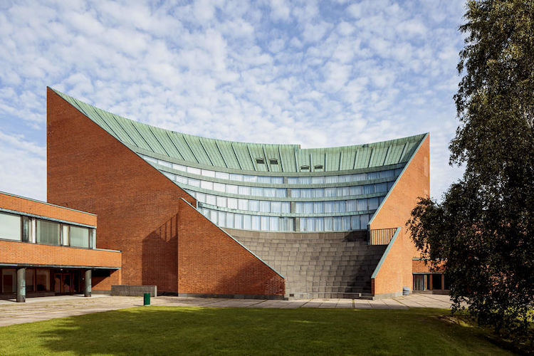
Alvar Aalto, University of Technology (Photo: Aalto University)
Related Articles:
Bauhaus: How the Avant-Garde Movement Transformed Modern Art
11 Architectural Styles That Define Western Society
How Impressionism Changed the Art World and Continues to Inspire Us Today
Iconic Modernist Buildings Reimagined Inside Idyllic Thomas Kinkade Paintings


